Visual impact matters — and fast. Studies show that people form a first impression within 90 seconds, and up to 90 % of that impression is influenced by color alone. That’s the power of visual fluency — design that is easy to process doesn’t just capture the eye, it builds trust.
Design is more than decoration — it carries meaning. The concept of sensation transference, coined by marketing psychologist Louis Cheskin, showed how subtle design choices — like switching packaging from plain paper to foil — can dramatically shift perceptions and sales. In other words, design isn’t just aesthetic — it’s a psychological lever that moves the needle.
We asked our Design Lead to answer ten essential questions that help affiliate marketers grasp the foundational principles of effective design. His responses shine in clear, down-to-earth advice — and they’re more than just ideas: they’re rooted in real-world psychology and backed by research.
Against this backdrop, our Q&A offers a no-fluff, actionable guide: how to craft banners and landing pages that don’t just look good — they work. From headlines to CTA buttons, from color choices to layout priorities, these are the building blocks that turn clicks into conversions.
Q: How do you define good design in the context of affiliate marketing?
A: Let’s take a banner as an example – it’s the clearest way to illustrate the point. In affiliate marketing, “good” design really means “functional” design. Its primary purpose is to make the user click. So the user should immediately and effortlessly understand what they’ll get if they do.
The formula is simple: a bold, concise headline, an equally short subheadline if needed, and a strong CTA button. All text should be clearly contrasted against the background and against each other – but without turning into a flashy rainbow. Two to four contrasting colors are usually enough.
For background imagery, simplicity wins again. It’s far better to show one thing clearly and at scale than to fill the space with several smaller, competing visuals.
Q: What sections do you consider essential on a landing page if the goal is conversion?
A: The most important sections are always the ones that fit into the very first screen when the page loads. If that initial view catches the user’s attention, they’ll likely scroll and read the rest. That’s why everything you truly need to communicate should appear there. But that doesn’t mean cramming in lots of tiny blocks – one or two strong sections are more than enough, aside from the navigation at the very top.
The first block is basically a big, full-width banner. It should immediately show what the product is and why the visitor needs it. The formula is clear: Headline + Subheadline + CTA. Optionally, you can make this section a slider with three to five slides at most.
The second block can be more flexible – something custom that didn’t fit into the first one but still feels important. If nothing else is mission-critical, I’d place a contacts section or direct links to registration there. After that, you can expand with all the extra details and supporting content.
Q: How do you decide the order in which landing page sections should appear?
A: Everything important needs to sit as close to the first screen as possible – what you’re offering and how the user can get it. The further down the page, the lower the chance someone will actually scroll and see it.
As for the very end of a landing page, I’d always include a contacts section – even if you already placed one earlier – plus a footer with all the required information. That way, no matter how far a visitor scrolls, they’ll always finish with the essential details.
Q: What makes a button visually appealing in design? Which texts and visual patterns tend to work best?
A: When we talk about a CTA button, contrast is non-negotiable. It has to be the one element on the screen that’s impossible to miss. At the same time, the text should give a quick answer to the question “What’s there for me?” – and it should do so in as few words as possible. Ideally one to five words, the shorter the better. For example, if you’re promoting a game, “Play now!” or “Play for free!” are spot-on choices – assuming, of course, that the background image and headline already explained what the game actually is.
Visually, the button can go either way – styled with gradients and effects, or kept minimalistic. But whatever the choice, it should always stand out against the rest of the banner and never fade into being a secondary element.
Q: Do you keep a “library” of UI patterns that always work – things like forms, cards, or icons?
A: Not in a literal sense. I don’t keep a folder full of static templates that I drag from project to project. Instead, I save references that inspire me – on Pinterest, Behance, Instagram, Telegram – each in its own thematic collection. This way, I’m always pulling from a pool of fresh, relevant ideas rather than recycling something that was trendy five years ago but feels outdated today.
When a new task comes up, I just browse my saved references and see what still feels current. For example, let’s take a card design. Step one is to ask: is a card really the best solution here, or is there something more effective? If the card is indeed the right choice, then step two is to study how cards are being designed right now – and decide what to borrow or improve.
If I were to give a bit of advice, I’d say this: don’t just stockpile random UI snippets in a dusty folder. Organize your inspiration by theme, keep it updated, and revisit it often. That way, when you need a solution, you’ll have a living, evolving library – not just a museum of old design patterns.
Q: Which colors or visual choices help build trust and increase engagement?
A: Honestly, it depends on a lot of factors – the product itself, the target audience, even the personal taste of whoever runs the brand. You’ll often see two competitors in the same niche use completely different palettes, and both can still be successful.
What matters more than the specific colors is how they work together. The palette should always have enough contrast to make the message instantly clear. If a user has to strain to figure out what’s being offered, you’ve already lost them.
Visual elements and graphic techniques should always support that same principle – clarity first. The design isn’t there to show off fancy effects, it’s there to help the user understand the offer without hesitation.
Q: Which colors or visual approaches tend to build trust and boost engagement?
A: Color choices are shaped by many variables — the nature of the product, the target audience, and sometimes even the subjective preferences of the brand team. In nearly every niche you’ll find competitors using very different palettes, yet both can feel confident in their choices.
What matters more than the exact shade of blue or red is the combination of colors. The palette should be clear and contrasting enough that the user instantly understands what’s being communicated. If they have to stop and “decode” the design, you’ve already lost momentum.
Visual decisions and graphic techniques should always serve the same purpose — clarity and focus. At the end of the day, design isn’t meant to overwhelm; it’s meant to make the message effortless to grasp.
Q: How would you choose visuals for an offer – things like screenshots, icons, characters, or backgrounds?
A: Ideally, I’d start with the product’s brand guidelines – they should have everything spelled out already. But in reality, we don’t often get that luxury. So the next step is to look at what’s available: app screenshots, store pages, previously made banners. Sometimes even the product’s name alone can spark a direction. Out of that mix, something interesting and relatively unique usually emerges.
If speed is more important than uniqueness, a simple solution also works. We can set our own color and font scheme, then grab stock photos and backgrounds to fill it out. Done right, that can still result in a clean and effective design – as long as it doesn’t clash too heavily with the existing logo or product icon.
Q: What are the two or three most common mistakes you see on affiliate landing pages?
A: The first one is visual overload – too many colors, too many fonts, too much noise. When everything is screaming for attention at once, the user has no idea what they’re supposed to focus on.
The second is sloppy use of AI-generated visuals. Low-quality generations with visible artifacts stand out immediately – and not in a good way. They can really hurt the perceived credibility of the service. The same goes for lifeless, overly staged stock photos.
And the third is making the landing page unnecessarily long. Sometimes it feels endless, with block after block that adds no real value for the user. If someone is genuinely interested, they shouldn’t have to scroll forever just to find a piece of useful information. Keep what’s truly helpful – cut the rest.
Q: What advice would you give to webmasters building a landing page without a designer?
A: Keep it short and clear. The less content you include, the easier it is to make it correct and understandable. Overcomplicating almost always works against you.
Also, don’t be afraid to use the tools that are out there – online generators for color palettes, font pairings, stock photo libraries, all of that. These resources exist to make your life easier, and if you use them wisely, you can get a clean, professional-looking result without needing a full design team.
Q: Can you share 2–3 examples of landing pages that you think are well-designed?
A: Sure. Let me pick three that, in my opinion, show the basics done right.
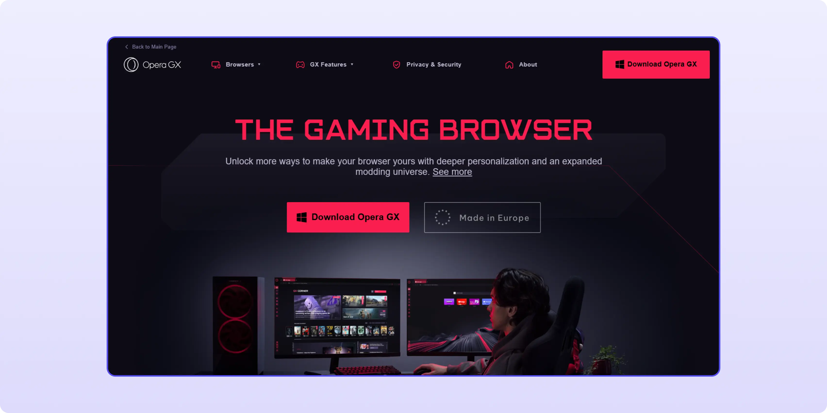
1. Opera GX
On the very first screen it’s crystal clear what the product is — “The Gaming Browser”. Big headline, strong CTA button, and the whole visual built around a single bold idea. There’s no clutter. You instantly understand what you’re getting and what action to take. And then the following blocks just expand on that promise — features, personalization, integrations. Everything is in order, starting with what matters most.

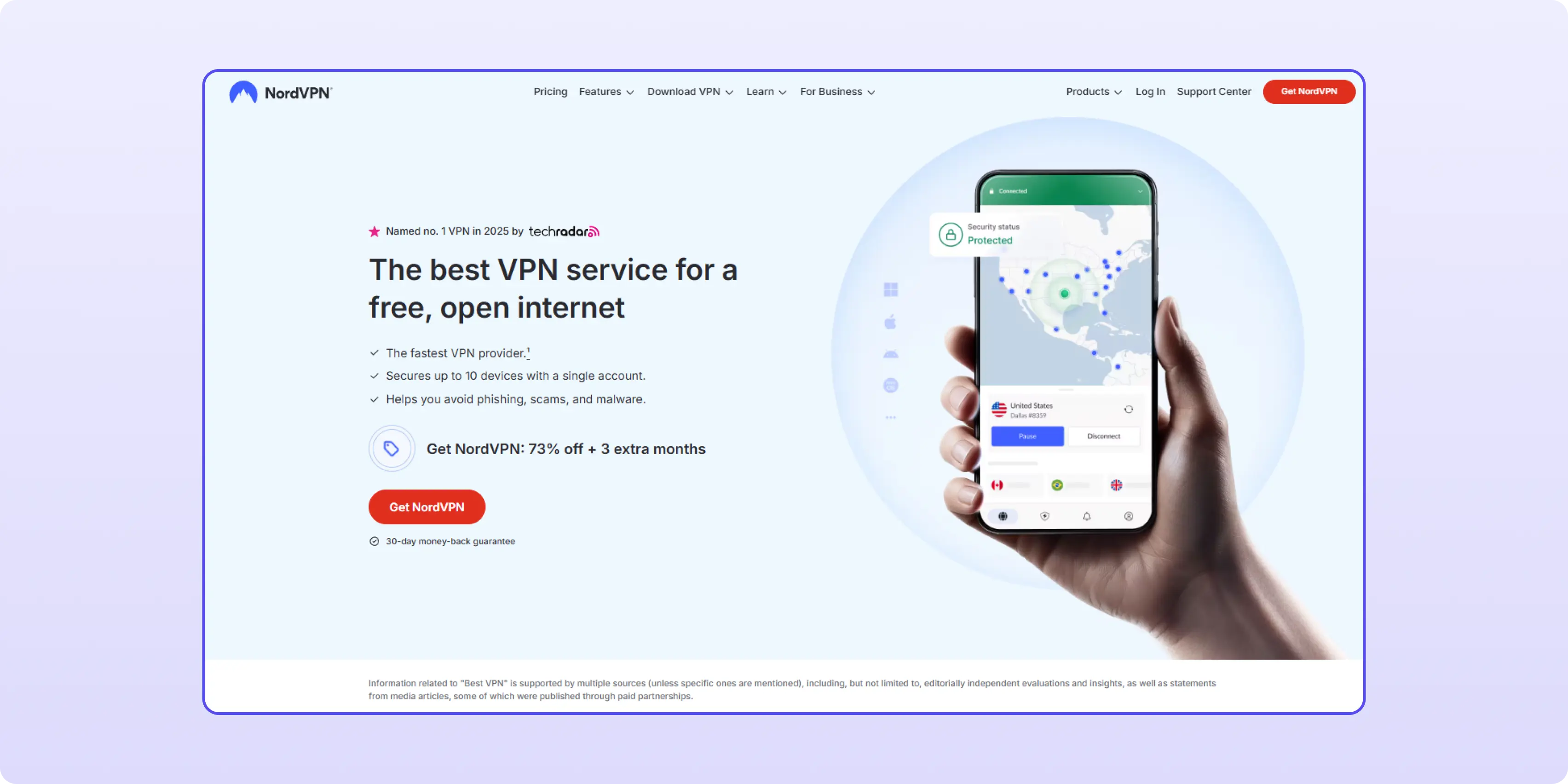
2. NordVPN
Here the landing does a great job of combining clarity with trust. The headline says exactly what the product is and why you need it, the CTA is right there, and they even add a “30-day money-back guarantee” to reduce hesitation. Plus, they use social proof — awards, ambassadors — but keep it compact and close to the top, so you don’t need to dig for reassurance. That’s the kind of balance I like: first tell me what it is, then show me why I should trust you.

3. Movavi
Movavi’s site is very straightforward. Headline tells you it’s an “all-in-one video-making bundle,” and you immediately see two buttons: Download for free or Buy now. That’s smart because different users arrive with different intent — some want to test, some are ready to pay. Right below that, they show the core tools and add numbers like “70M+ users.” It’s a clean hierarchy: product → proof → extras. No endless scrolling, no unnecessary noise.

All three of these pages follow the same principle I’ve been talking about: start with a simple and clear first block, use contrast and one strong visual focus, and keep the rest of the page organized by importance. That’s what makes design functional — it guides the user straight to the click without distractions.
Extra - Affiliate Landing Page Design Checklist
1. Above the fold — capture attention fast
- Headline: bold, short, and clear.
- Subheadline (if needed): concise and supportive.
- CTA button: bright, contrasting, readable, with 1–3 words answering “What’s there?” (Play now!, Get started).
2. Minimize visual noise
- Use no more than 2–4 contrasting colors.
- One strong visual focus (product, character, or key object) instead of multiple small elements.
3. Block order & structure
- Prioritize important content close to the top.
- Second block: either extra important info or contact/registration section.
- At the very end: repeat contact info + footer with legal essentials.
4. Trust through clarity
- Contrast and legibility ensure the offer is instantly understood.
- Avoid color explosions or font overload.
5. Psychology of aesthetics
- First impressions form in ~90 seconds — up to 90% influenced by color.
- Simple, clear design builds trust and boosts engagement.
6. UI patterns & inspiration
- Collect design references (Pinterest, Behance, Instagram) by theme, not as static templates.
- Always ask: is this UI element (card, form, etc.) truly needed?
- If yes, adapt modern examples instead of reusing outdated ones.
7. Choosing visuals
- Use product guidelines if available.
- Otherwise: app store screenshots, existing banners, product pages.
- For quick builds: define your own palette + stock photos, but make sure they don’t clash with the logo or brand identity.
8. Common mistakes to avoid
- Overuse of colors and fonts → visual chaos.
- Poor AI-generated visuals with artifacts → hurts credibility.
- Endless scrolling pages with filler content → only keep what’s valuable.
9. No designer? No problem
- Keep it short and simple.
- Use free tools: online palette generators, font pairing tools, and stock photo libraries.
10. Bonus industry best practices
- Add social proof: reviews, testimonials, partner logos.
- Limit navigation links — focus attention on the CTA.
- Highlight benefits over features — show what users gain.
- Ensure mobile optimization and fast load speed.
